As a new employee at 42talents, your first task is to give a round of maintenance to the company website. Like many informative websites, it uses a static website generator to simplify its maintenance and get better performance out of it.
However, even simple websites require ongoing maintenance to keep them relevant. Web technologies change and improve, search engines prioritize websites that follow best practices and while the effort to reach those goals is not much, it can easily fall behind and become a problem.
What are the most common problems, and how do you fix them? We collected all the major issues we found on our website and how we fixed them.
Collecting measures about your website
To be able to improve your website's performance, you first have to know what are the problems you currently have. With proper measurements, you not only can figure out the priority of your fixes, but you can also tell if your changes had a successful impact or not.
Two useful tools to use in this case are Webpagetest and Lighthouse. The first tool can run in any browser and can include results from Lighthouse as well. It is a little harder to read but gives profound insights.
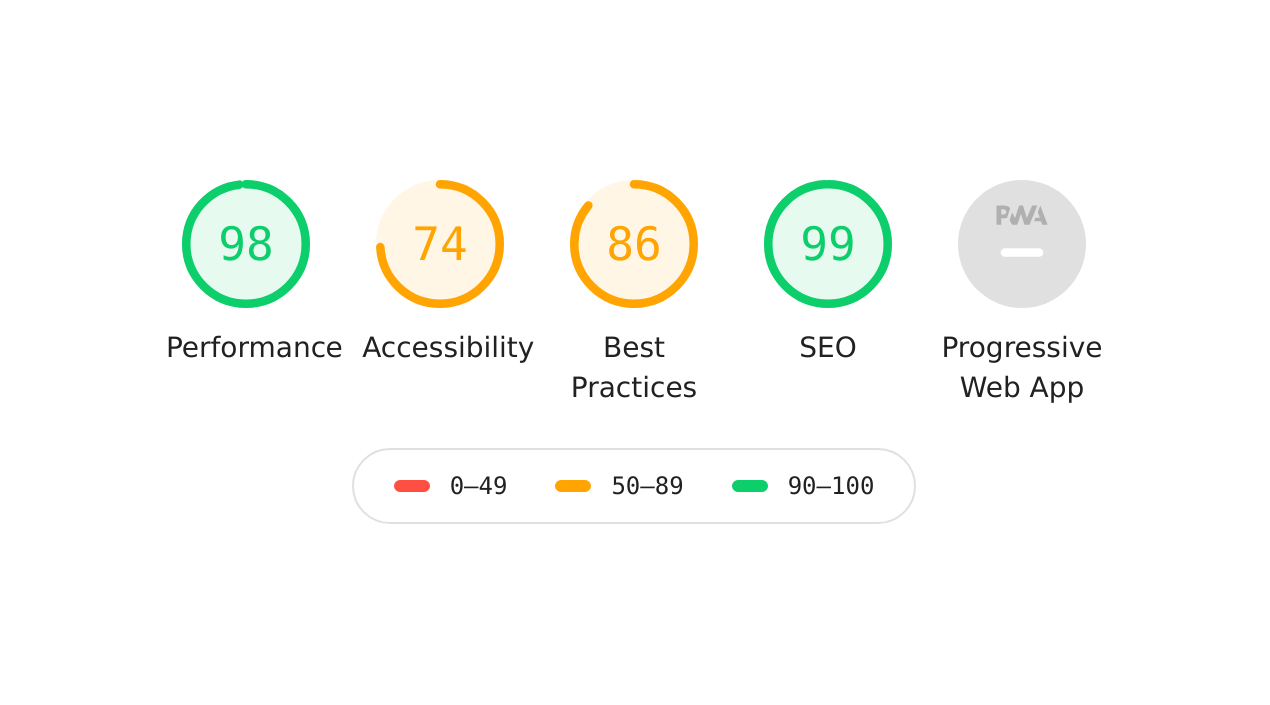
Lighthouse can run in any recent version of a Chrome-based browser right inside the developer tools. We'll focus on the Lighthouse score here since it is better suited as a starting point.
Running your first Lighthouse audit is quite simple: navigate to your website, open the development tools, go to the Audits tab and click on Generate Report.
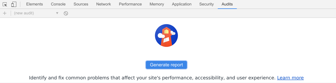
Lighthouse runs a series of tests and generates a report. This report includes a list of optimizations that can you can perform to increase the score of the various sections. Let's dive in!
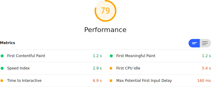
The performance section is probably the most important one to look at and sometimes the hardest to figure out. While some problems require a deeper dive into other tools, the biggest problems are usually relatively simple to fix.
Images
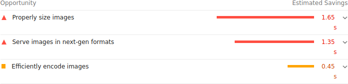 Images are the most common and biggest culprit. Delivering your images right is the single most effective performance optimization you do.
On our website, we automatically run all our images through ImageOptim to ensure they are properly optimized for web delivery. However, this was not enough: images have to be in the right format, have the appropriate size and be saved with the right balance between image quality and size.
After doing this, Lighthouse would still suggest using properly sized images. A shortcoming of the good old <img> tag is that only one image can be specified, and it has to fit a variety of use cases. Mobile users will have a different layout where the image might take the whole width and, while smaller, it is viewed on a high-DPI screen. Desktop browsers might display bigger images, but with lower DPIs. In short, it's not possible to have one image fulfill at best all these use cases.
Here come responsive images: HTML introduced srcset and <picture> to solve this exact problem.
With the srcset attribute you can define multiple variations of the same image and let the browser select the most appropriate one.
The <picture> tag allows you to specify even more alternatives, for example with different aspect ratios or with newer formats like webp.
Our HTML changed from this:
  <img src="/path/to/myimage.jpg"
       alt="Big image"
       width="696"
       height="288">
to the following:
<picture>
  <source srcset="/path/to/myimage-1270w.webp 1270w,
                  /path/to/myimage-800w.webp 800w,
                  /path/to/myimage-400w.webp 400w"
          type="image/webp">

  <img alt="Appropriate image"
       src="/path/to/myimage-400w.jpg"
       sizes="(min-width:  992px) 25vw,
       (min-width:  768px) 50vw,
       100vw"
       srcset="/path/to/myimage-1270w.jpg 1270w,
               /path/to/myimage-800w.jpg 800w,
               /path/to/myimage-400w.jpg 400w">
</picture>
Key takeaways
- Size your images appropriately.
- Use the right image format.
- Use automated tools to optimize your images for the web.
- Try reducing the jpeg quality or the color palette while maintaining the same visual quality.
- Use progressive jpegs with bigger images.
- Serve different images for different devices.
- Serve modern formats to browsers that support them.
Accessibility
Improving the accessibility of a webpage is often simpler than one might expect. While there are bigger changes you can make to improve the accessibility of a website, most things require less than a few minutes to address.
Here is a small list of such improvements:
- Use an appropriate viewport meta tag.
- Ensure all images have an appropriate alt attribute.
- Prefer semantic HTML, but fall back to ARIA to help identify elements.
- Ensure links have a minimum clickable area of 44x44. Mobile users will love you for that!
- Use colors with enough contrast to help the readability of your texts. Chrome Devtools can help you to find the right combination.
SEO optimizations
When it comes to SEO, the basics are quite simple and require minimal effort to accomplish. Yet it's sometimes overlooked and leads to less than optimal results.
These are the adjustments we did to our website:
- Check and update the description meta tags.
- Add json-ld to better structure information on the page.
- Add Open Graph information for better social media sharing.
- Verify the content of the sitemap.
Conclusion
Websites need constant maintenance to stay relevant and up-to-date. As techniques evolve, and the web progresses, we need to adapt what we have to best serve our visitors. As shown above, it is not difficult to improve. Hopefully this article serves as a checklist for your website, and it can help you achieve a better score which, ultimately, not only gives you a chance at a better placement in search engines, but it also serves your visitors with a better experience.